7 golden rules for a successful poster gallery wall
Height, spacing, color harmony: our 7 rules for creating a poster gallery wall that works, at home or in the office.

Key points
- 18 posters in the Living room posters collection, all in the table below.
- From 19,95 € in A4, up to 69,95 € in A0, 5 sizes for each poster.
- Printed in Europe on demand, free delivery from 59 €.
The table
The 20 posters at a glance














Gallery walls: the art of composition
Putting together a gallery wall of posters may seem intimidating, but it follows a simple visual grammar. A few well-established rules are all it takes to transform a blank wall into a narrative composition. These are the principles we follow at Brunelia, whether we are creating a duo, a triptych or a nine-poster display.
Rule 1: centre everything at eye level
The visual centre of a gallery wall should sit between 145 and 155 cm from the floor, roughly the average eye level of a standing adult. When you are sitting on a sofa, this centre drops to around 130 cm. Adapt it to how the space is used, and start by marking the horizontal centre line.
Rule 2: keep the spacing consistent
Leave 4 to 6 cm between each poster, no more. Uneven spacing makes the arrangement harder to read and gives it a makeshift feel. Professionals often use exactly 5 cm, measured with a tape measure, to create the disciplined breathing room that makes the difference between attractive décor and a true composition.
Rule 3: create unity through colour or theme
Choose ONE common thread, and stick to it. Either all the posters share a colour palette (ochres, terracotta tones or pastel blues, for example), or they share a theme (cities, landscapes, travel or sports). Mixing too many colours AND too many themes leads to visual chaos.
Rule 4: vary the sizes within a grid
A successful gallery wall often combines one large central size (A2 or A1) surrounded by smaller sizes (A3, A4). Imagine a grid of 3 to 5 columns and place each piece within that structure. Avoid putting a lone A4 in a corner, where it will look lost.
Rule 5: arrange everything on the floor before drilling
Before hammering in a single nail, lay all your posters on the floor in the arrangement you want. Photograph the layout. Try several versions. This step prevents 90% of regrets after hanging everything.
Rule 6: painter's tape is your best ally
Cut kraft paper to the dimensions of each poster, then tape these templates to the wall in the planned arrangement. Live with them for 24 hours. If you still like the composition the next day, go for it. If not, make adjustments.
Rule 7: keep the frames cohesive
Use identical frames for a precise, museum-like effect, or frames in different materials but with a similar thickness for a cosy collector's look. The classic mistake is mixing very thick frames with very thin ones, which throws off the balance of the whole arrangement.
Putting together your poster selection
To create your framed wall, start with a shared theme or colour palette: Provence landscapes, botanical illustrations or posters for the kitchen. Choose the illustrations and sizes on their product pages, then check your composition before ordering.

Find out more

The golden rules of a poster gallery wall
A successful gallery wall follows 5 invisible rules, learned by gallery owners and interior architects. These rules make the difference between a composed wall and an improvised one that jumps out the moment you walk into the room. Here are the 5 essential rules, explained in 5 minutes.
Rule 1: a consistent theme that tells a story
All the posters on a gallery wall should speak to each other thematically. 5 French cities, 5 coastal landscapes, 5 Belle Époque portraits. Avoid the mix of Lyon + tropical sunset + Bauhaus, which dilutes the story.
Rule 2: color consistency
A common palette despite the variety of subjects. 3 to 4 dominant colors at most (ivory, terracotta, olive green, ochre, for example). Avoid saturated pop colors that break the harmony.
Rule 3: consistent spacing
Spacing of 5 cm for Scandinavian (airy), 3 to 5 cm for boho (tight), 8 to 12 cm for Art Deco (symmetrical, with room to breathe). Consistent spacing gives the composition its unity.
Rule 4: clear alignment
Align on the bottom edge or on the horizontal central axis. Align on the vertical center for a vertical composition. Alignment, even when invisible, structures the eye.
Rule 5: consistent frames
Identical frames for Scandinavian and Art Deco (order). Mismatched frames for boho (deliberate asymmetry). The style dictates the frame rule.
How to test a composition before drilling
Cut sheets of paper to the size of your frames and attach them to the wall with repositionable tape. Take a photo, adjust, start over. Once the composition is settled, drill. For 15 concrete compositions, see our guide to 15 compositions.
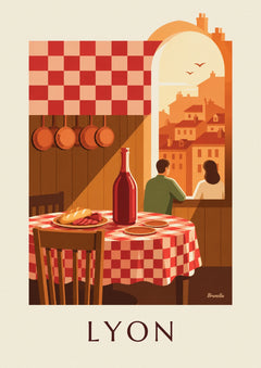
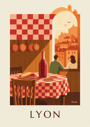
To create a gallery wall: Tours Cathedral and Loire Riverbanks Poster, Lyon Bouchon Poster, Checkered Tablecloth and Wine Pitcher, Three-Master Moored Beneath the Saint-Malo Ramparts Poster. Also be sure to explore our French cities collection.
To avoid drilling into the wall, see our guide to hanging without drilling.
Also on the journal: 15 compositions, staircase gallery wall, travel gallery wall.
Build this wall
3 posters from this article, at true scale



All 3 posters: 99,85 €
Frequently asked questions
You often ask us
What are the 5 rules of a successful gallery wall?
Consistent theme, color consistency, constant spacing, clear alignment, consistent frames. 5 rules that make the difference between composition and improvisation.
What spacing should you leave between frames on a gallery wall?
5 cm for Scandinavian (airy), 3 to 5 cm for boho (tight), 8 to 12 cm for Art Deco (symmetrical, with room to breathe).
Should frames be aligned or arranged freely?
Clear alignment for Scandinavian and Art Deco. Asymmetrical layout around a central axis for boho. The style dictates the rule.
How do you test a composition before drilling?
Cut sheets of paper to the size of your frames, attach them with repositionable tape, take a photo, adjust. Once it’s settled, drill.
Should frames match or be mismatched?
Identical frames for Scandinavian and Art Deco (order). Mismatched frames for boho (deliberate asymmetry).
Keep exploring